About the Project
Making a Fun Zine with Risograph Printing
Making a Fun Zine with Risograph Printing
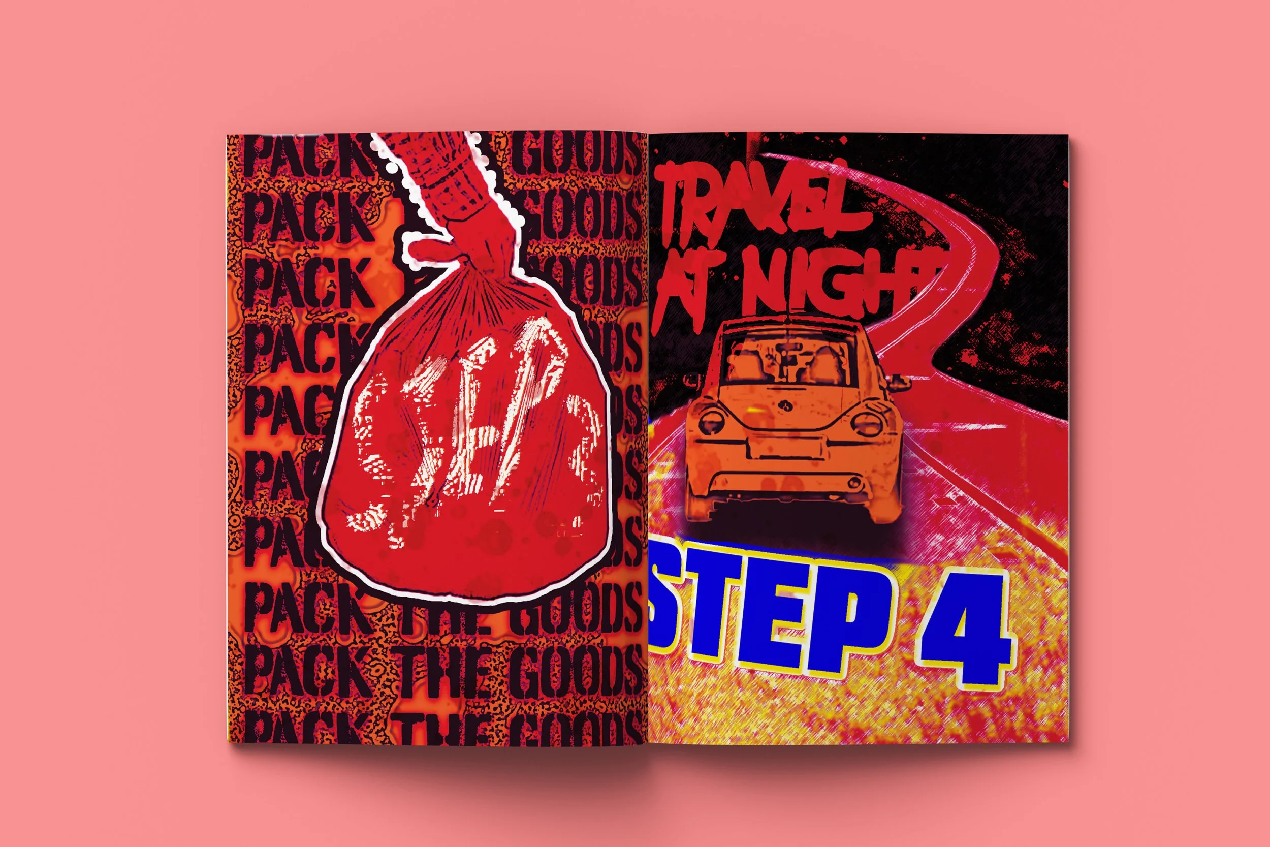
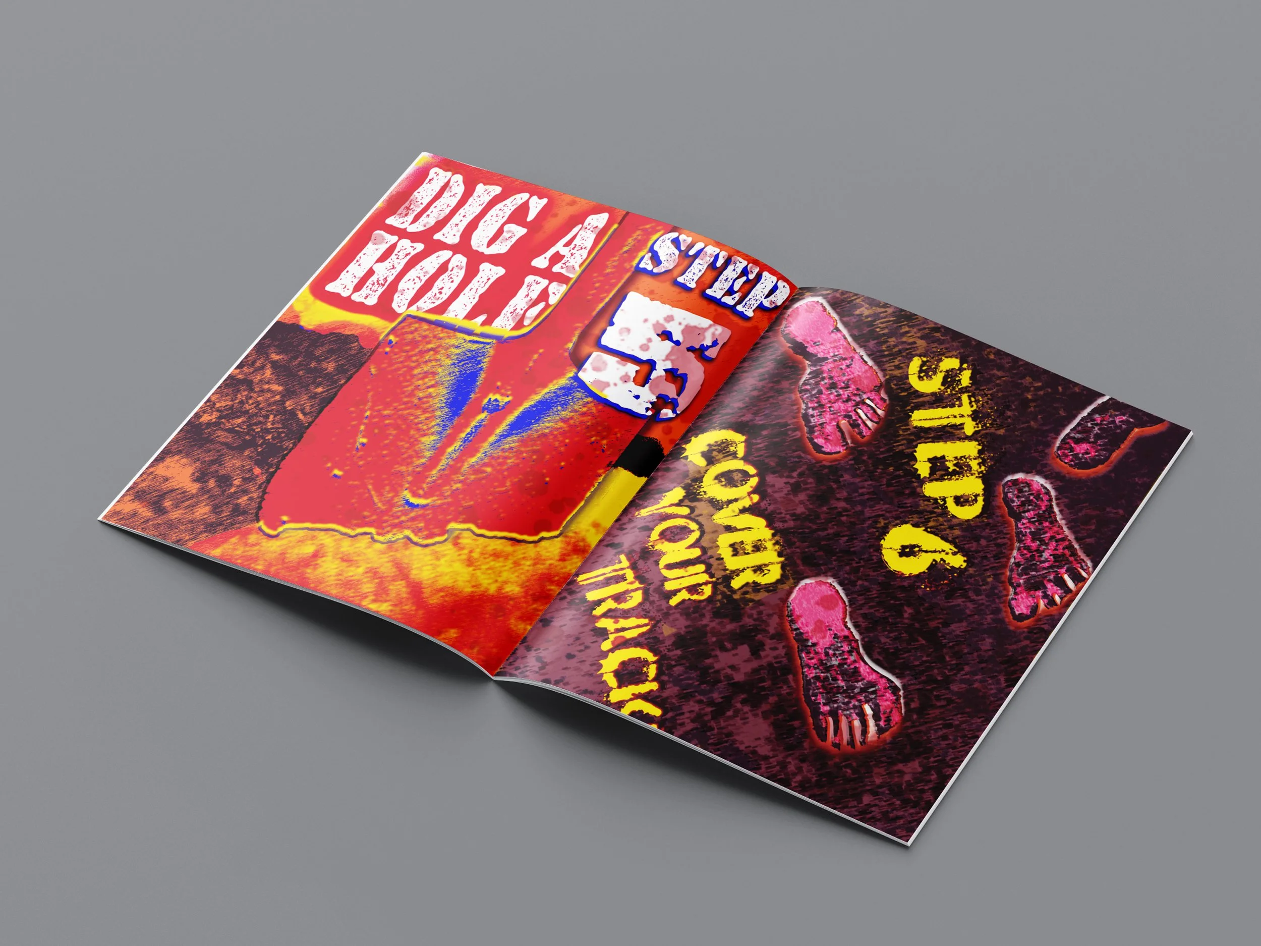
I created a fun, experimental zine using risograph printing, a process that’s equal parts magic and mayhem. I was drawn to its bold colors and gritty, unpredictable textures, but quickly learned that working with Riso is anything but straightforward. Each page became a puzzle: dealing with misaligned layers, limited color options, and the quirks of ink coverage meant constantly adapting my designs on the fly. But instead of fighting the imperfections, I leaned into them. The constraints forced me to think differently- layering with more intention, planning more strategically, and embracing happy accidents as part of the final aesthetic. What started as a challenge turned into a creative breakthrough, pushing me to grow as a designer in ways I hadn’t expected.
Role
Cover Design
Layout Design
Creative Writing
Digital Screen Printing
Client
Self-Motivated
Date
2025 Apr 17 - May 1
Identifying the Problem
#1
Identifying the Problem
Too often, designers fall into the trap of playing it safe, recycling familiar ideas and staying within the bounds of what's considered acceptable or "good" design. This self-imposed limitation stifles imagination, leading to work that’s polished but lacking in risk and personality.
What is the problem this Zine addresses?
What is the solution?
A design that tackles the creative rut of playing it safe, challenging designers to ditch the rulebook and embrace absurdity. By pushing a taboo concept to its limits, my zine demonstrates how enjoyable it can be to delve into the depths of creative exploration while also revealing how self-censorship and overthinking can kill bold ideas before they are even born.
#2
Research
Research
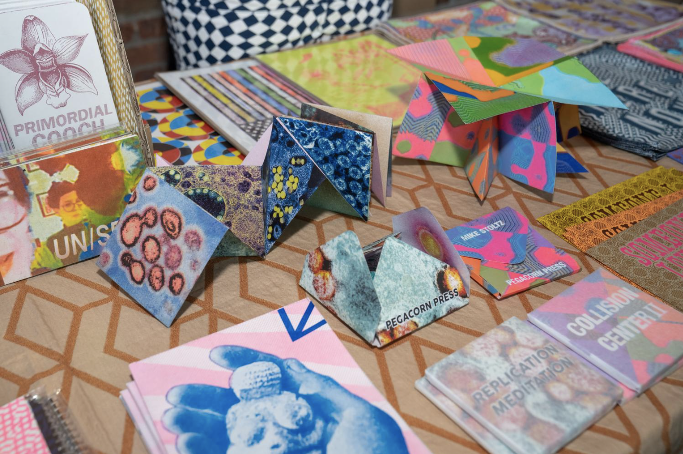
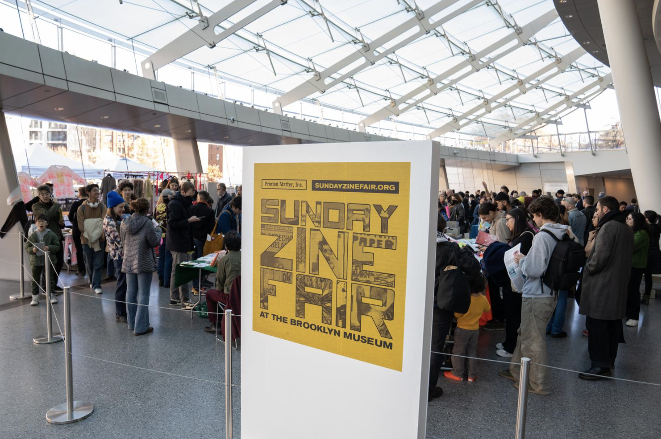
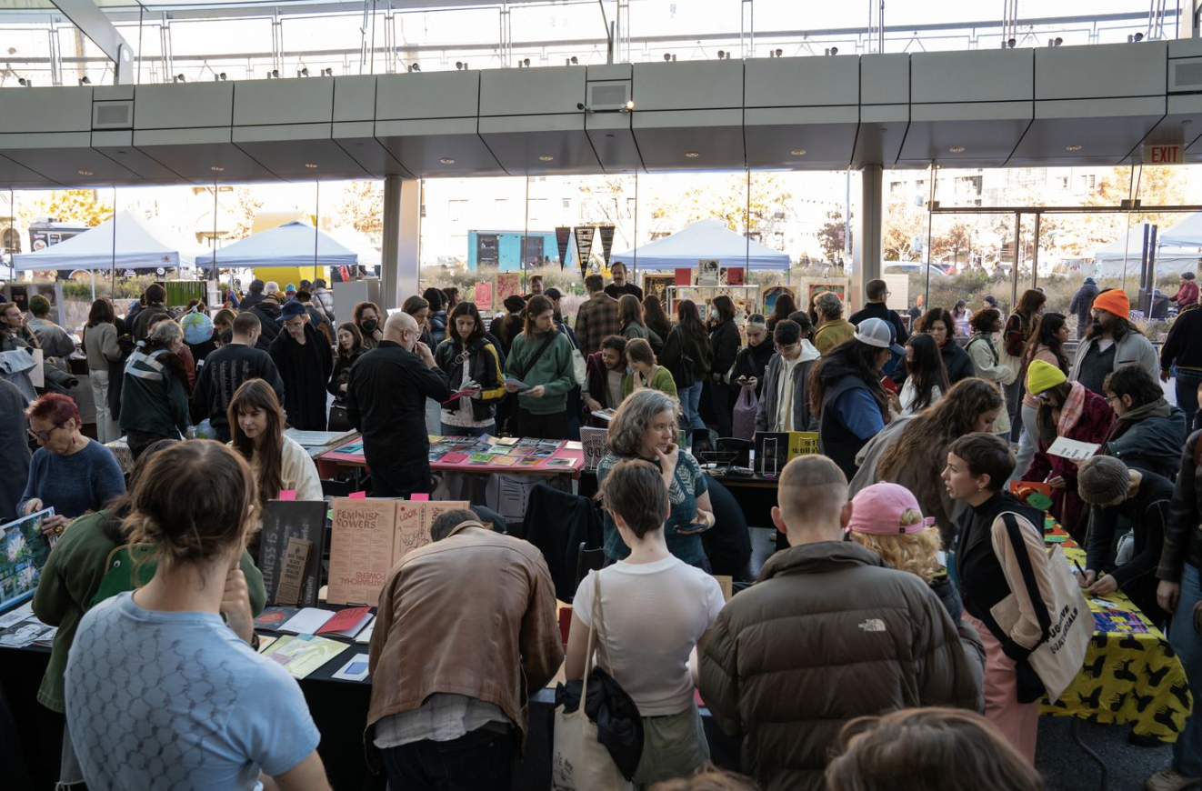
As part of my research for How to Get Rid of a Corpse, I attended a local zine fair where I spoke directly with creators about their processes, printing techniques, and design choices. Exploring a wide range of experimental works taught me how far the medium could be pushed, techniques like overprinting and knockout, while also giving me practical insight into layout, layering, and risograph limitations.
Going to a Zine Fair
#3
Mechanicals
Mechanicals
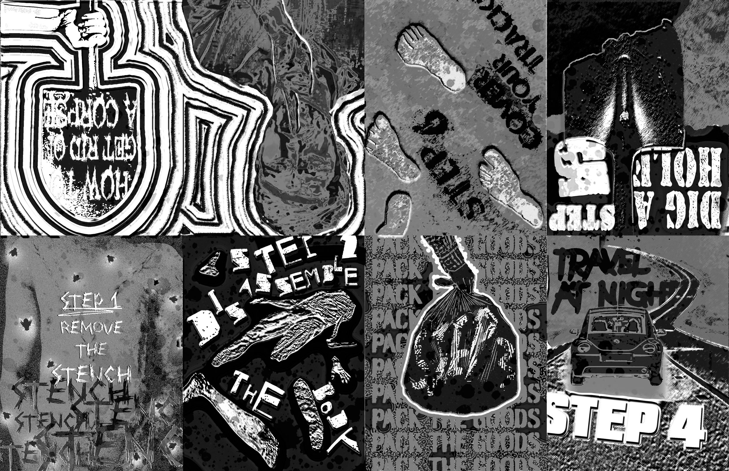
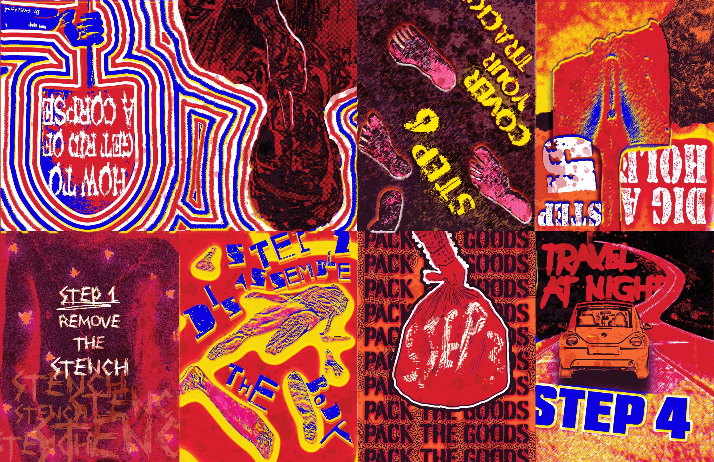
The skeleton of the Zine
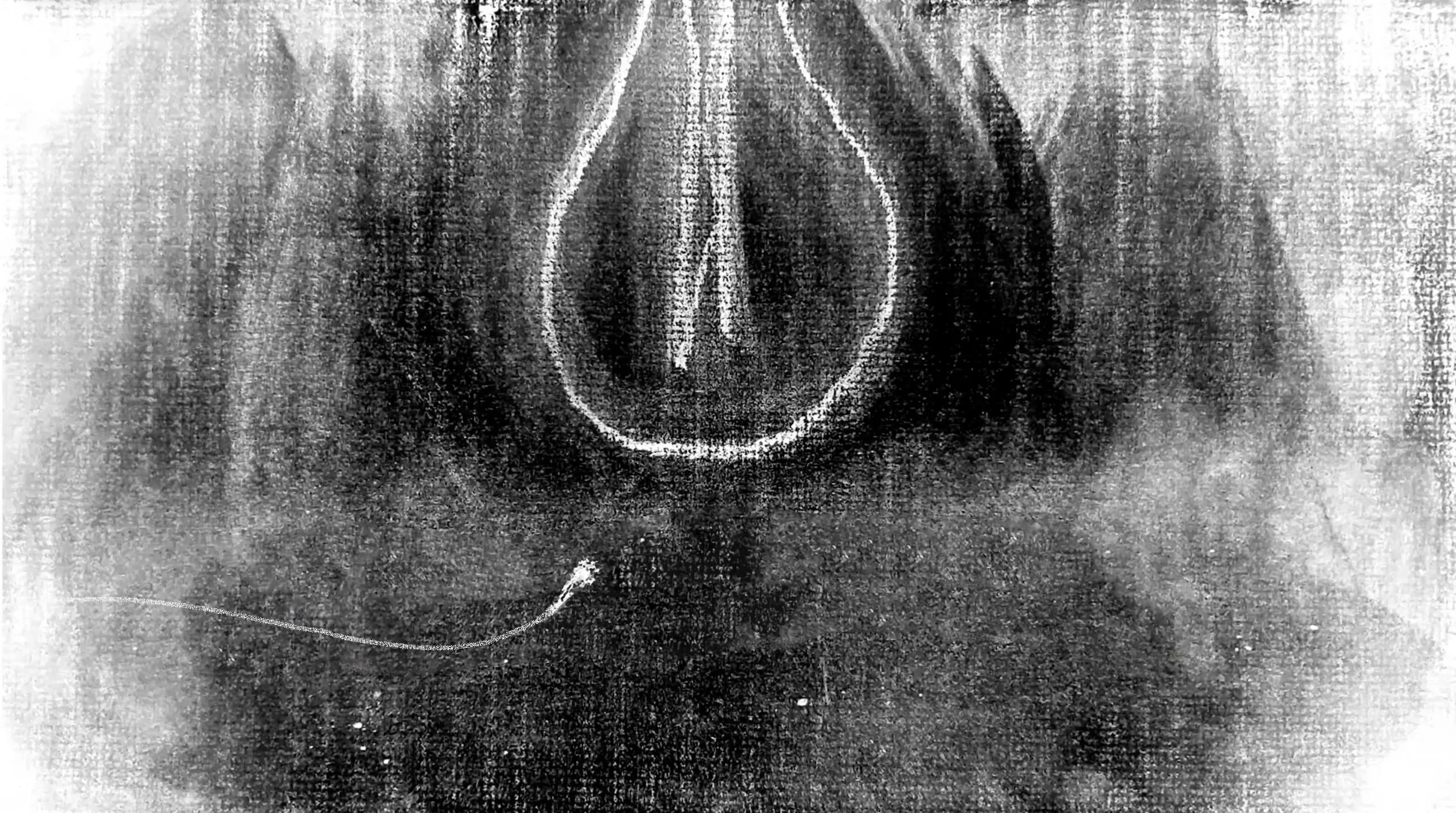
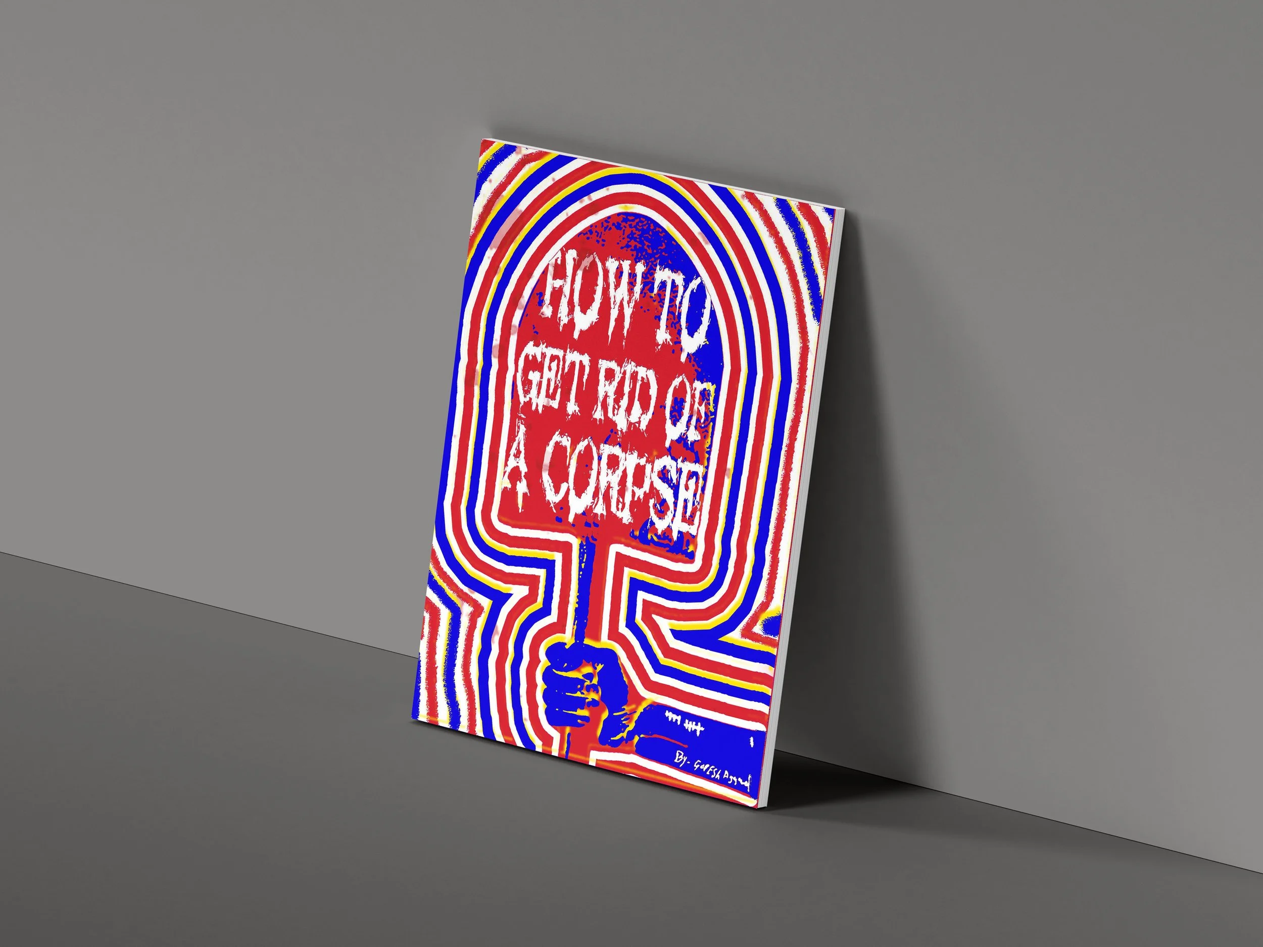
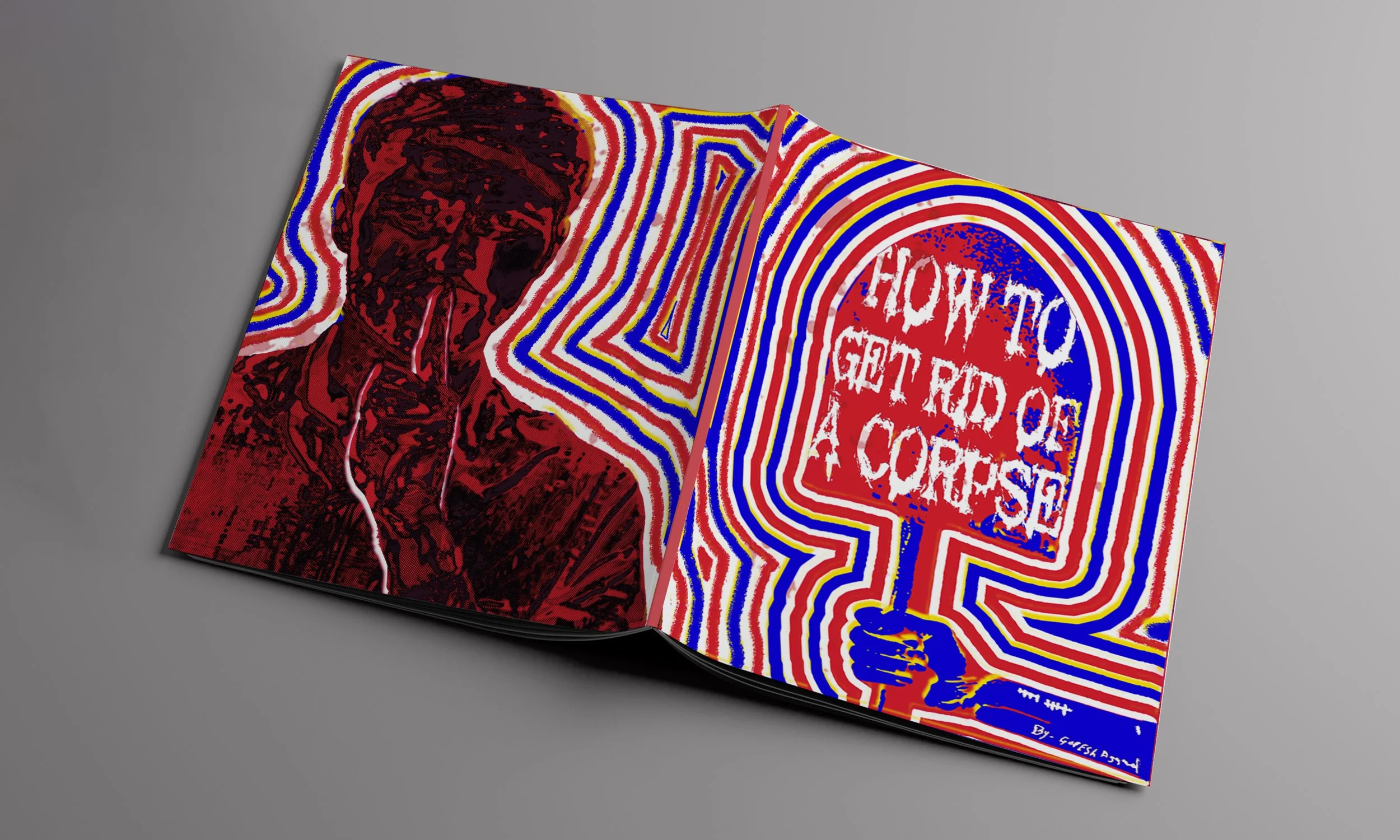
When creating the mechanicals for my zine, I limited myself to just three risograph inks: black, blue, and yellow. By carefully overlapping these colors in different opacities and orders, I was able to generate a surprisingly wide range of hues. This constraint pushed me to think strategically about layering, contrast, and how to maximize visual impact with minimal resources.
#1 Mechanical Black
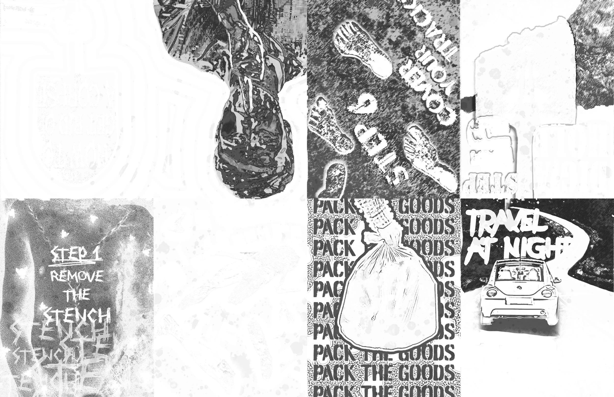
#2 Mechanical Blue
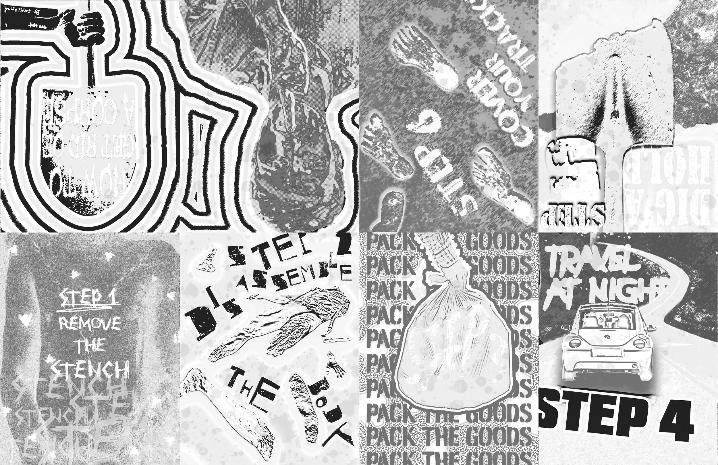
#3 Mechanical Yellow
#4 Color
#4
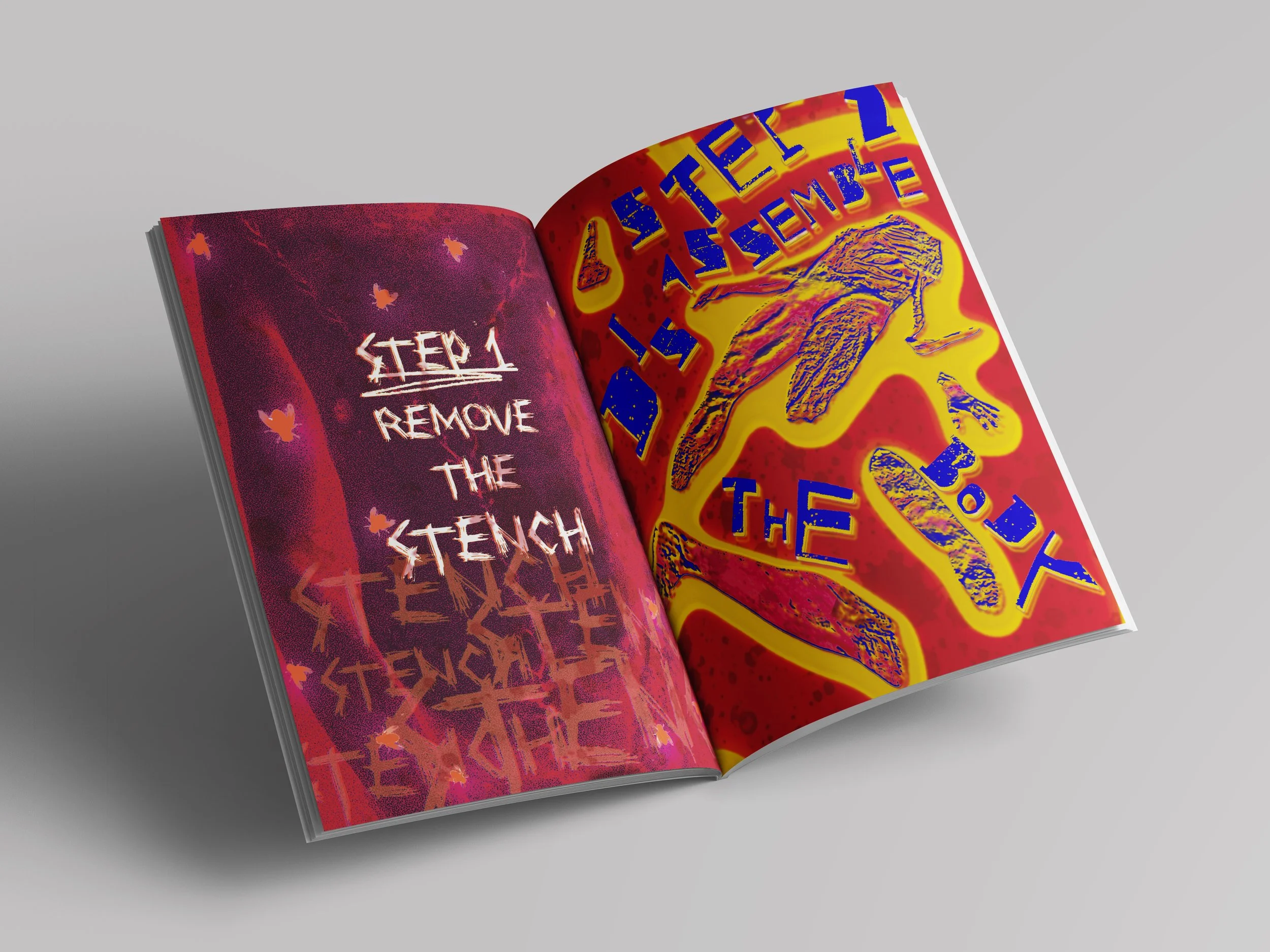
Final Zine
Final Zine

You may also like